Terra Somnia Editore
Editorial – Web – Graphic – Photograpy
CLIENT
Terra Somnia Editore
YEAR
2020 – on going
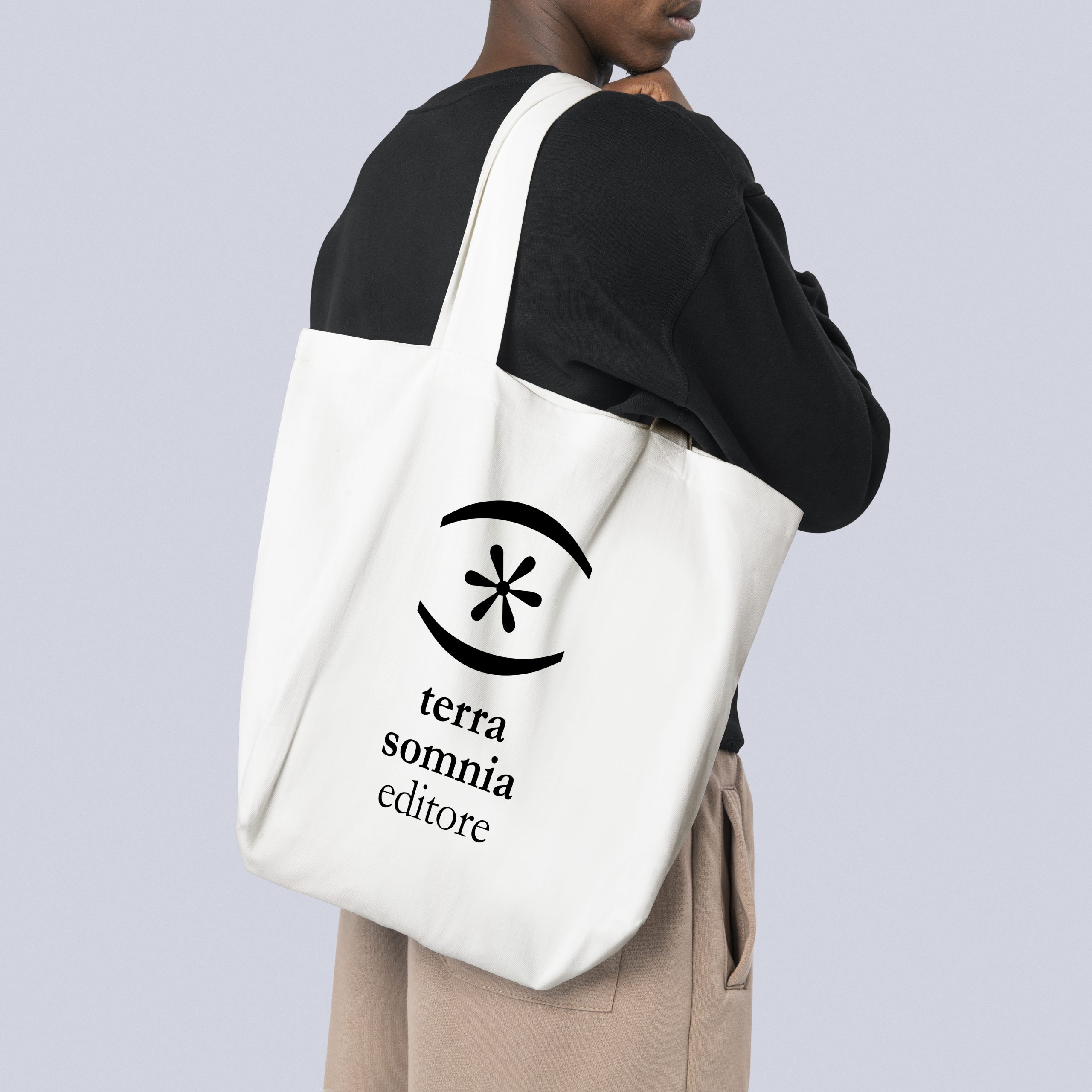
A new colorful identity for Terra Somnia Editore, a young independent publishing house. Fitting, composing A new identity full of colors for Terra Somnia Publisher, a very young independent publishing house. Framing, composing and putting letters and words together is the job of a writer, a poet. This is the concept behind TSE's new brand identity designed by Plam Studio. From the logo, to the necklaces, the playful language composed of typographic symbols becomes the common thread of Terra Somnia Editore's graphic design.
The identity of Terra Somnia Editore comes from the creative use of graphic signs, the meaning of the characters is modified, turned upside down to create new forms and suggestions. The signifier of the sign becomes the protagonist and tells the content of the series and themes dear to the publishing house.
Frontiere > <, series dedicated to fiction. Two elements look at each other and tend toward rapprochement without succeeding but without ceasing to try.
Strade //, series dedicated to legality. Two parallel lines, two roadways, the “straight” path to be pursued in the course of one's existence.
Nuoveterre ≃, series dedicated to foreign authors. The approximately mathematical, indicates a margin of insecurity to be faced in approaching other cultures.
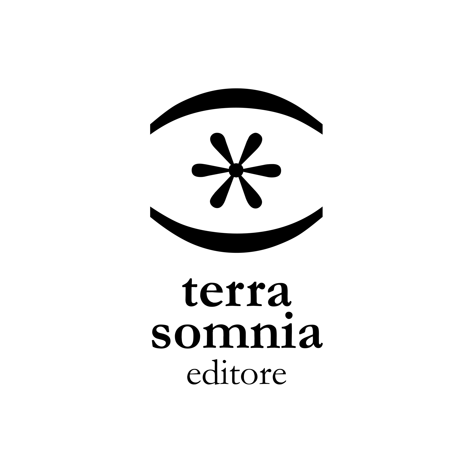
Fuoripista ⊂, container dedicated to out-of-series graphic novels with the symbol of inclusion.
Plam takes care of the entire graphic design department of the publishing house, managing layout, graphic design of new covers and series, layout and maintenance of the website.