Make Together
Brand identity – Graphic – Consultancy – Photography
CLIENT
Basso Profilo aps
YEAR
2023
WHERE
Ferrara
⇒ www.maketogether.
consoriowunderkammer.org
⇒ @maketogetherferrara
Graphic identity design for the three-year project “Make Together, a playground of opportunities in Ferrara: work, training and self-entrepreneurship.”
Project funded by the Municipality of Ferrara and the Emilia- Romagna Region.
Make Together sees the three creative hubs of the city of Ferrara (Factory Grisù Consortium, Wunderkammer Consortium and Laboratorio Aperto Ferrara), together with Cooperativa il Raggio Verde and Basso Profilo, united in the creation of a network between businesses, associations and public administrations.
Through a co-design process, the graphic identity of the entire project was created, guiding the communication team and related partners in the visual translation of the “city playground” concept.
The goal of the Make Together project is to provide, in an innovative way, educational and employment opportunities for young people. To create a “playground” that provides a different experience than the traditional job search: participants can actively confront each other, get involved, train and build their future among meetings and shared experiences together with the Make Together community.
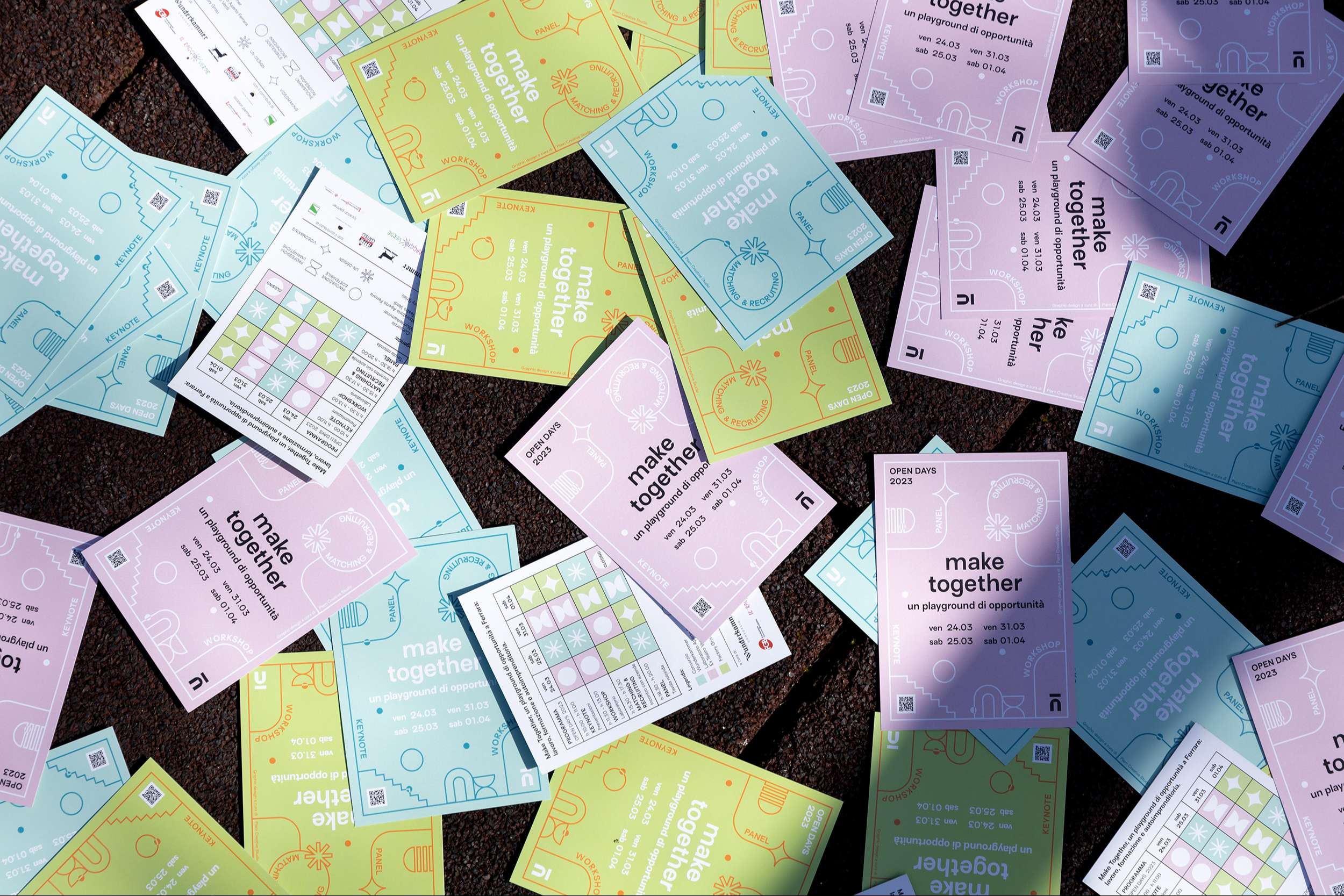
Four themes are addressed during the meetings: humanities professions, un-design, new media and sustainable innovation. The appointments unfold between talks, workshops, exhibitions and matching/recruiting meetings in a program of dates, throughout the 3-year project.
The Graphic Concept
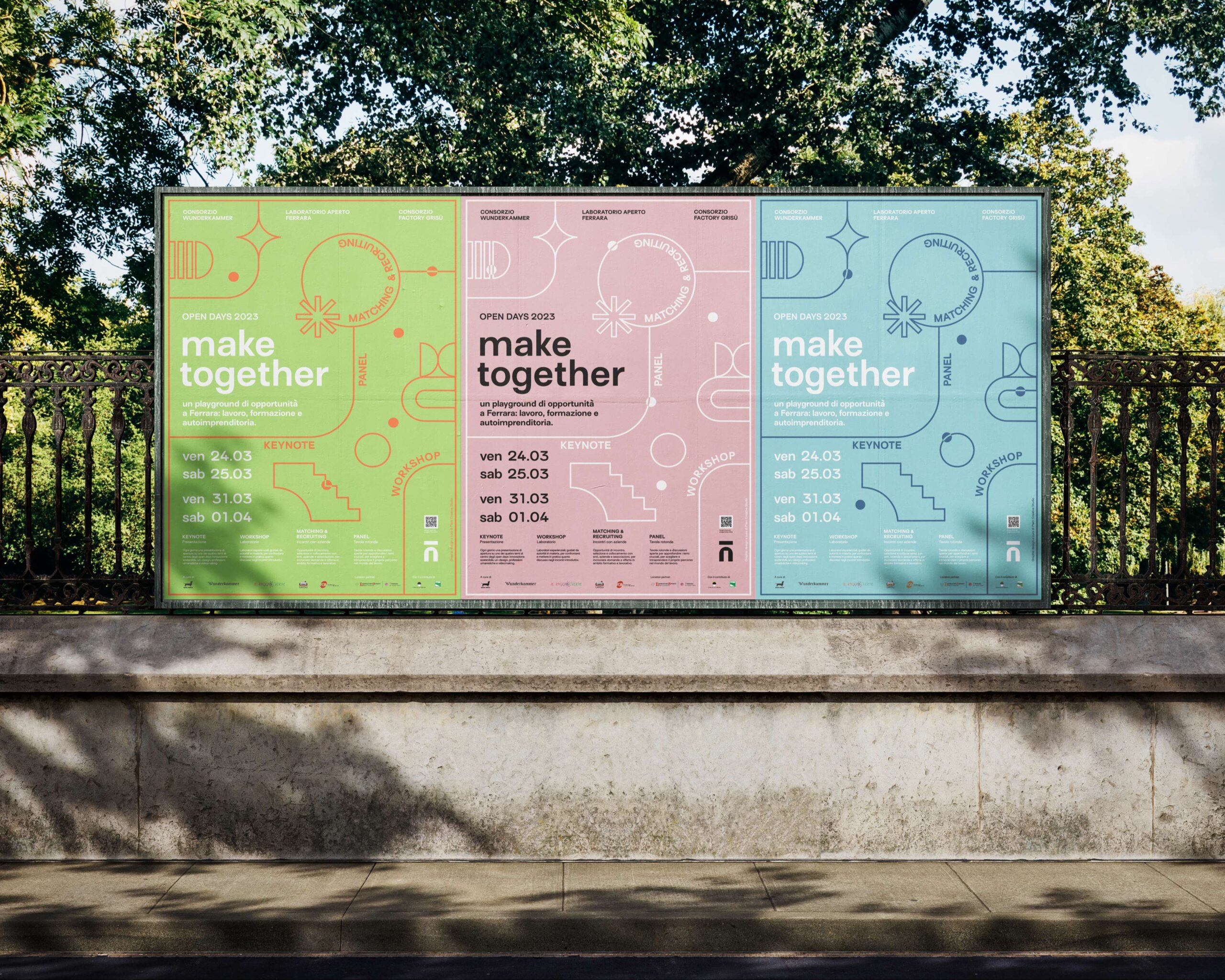
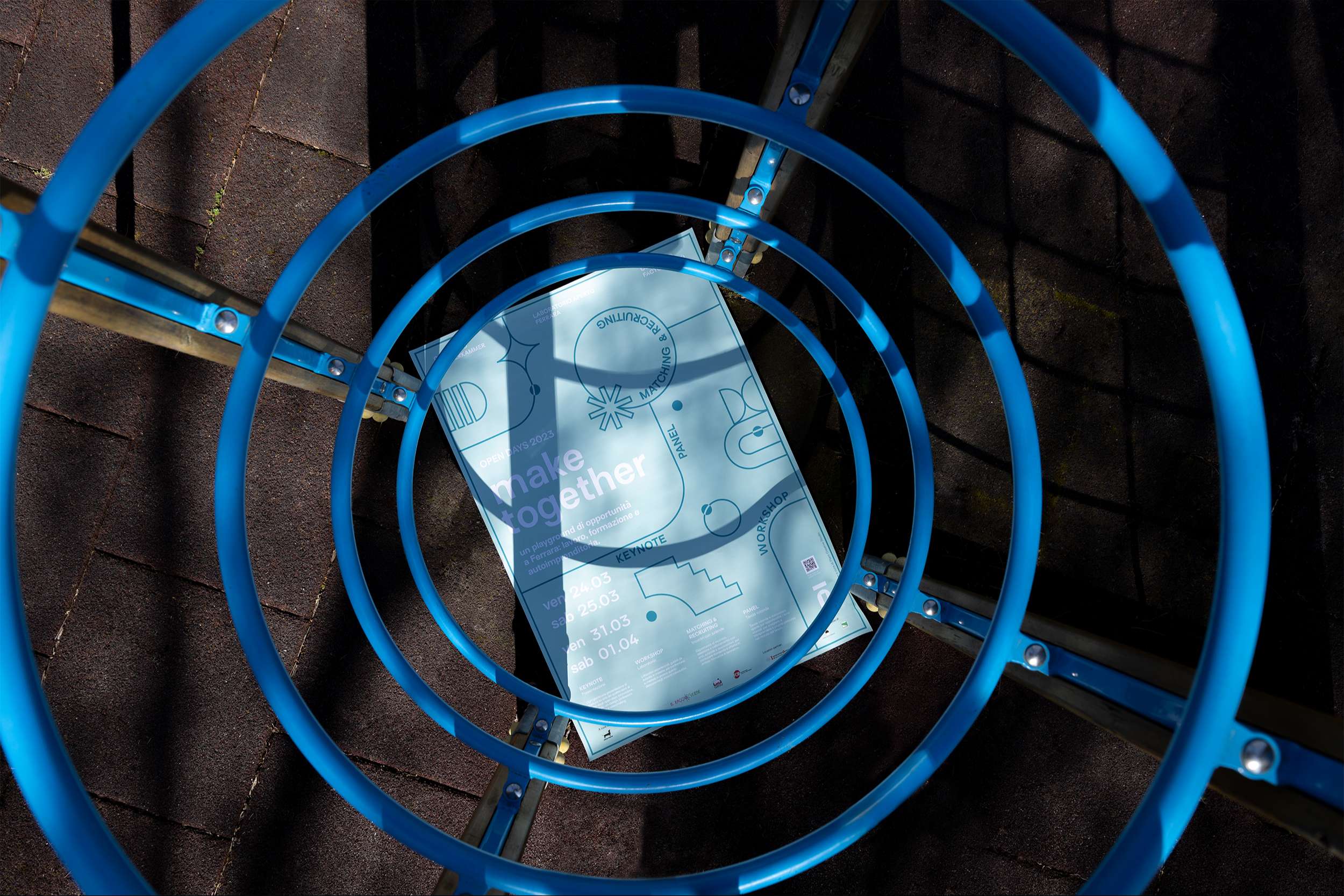
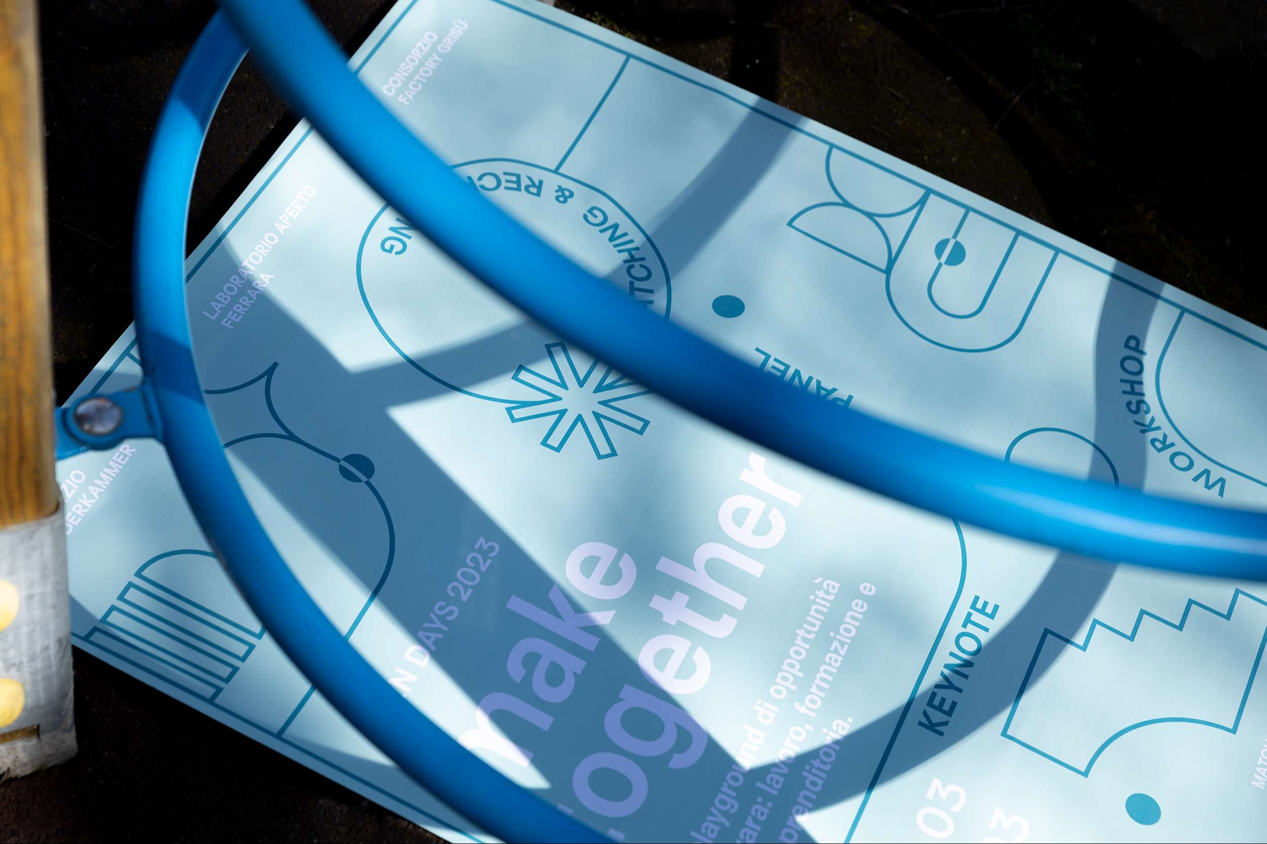
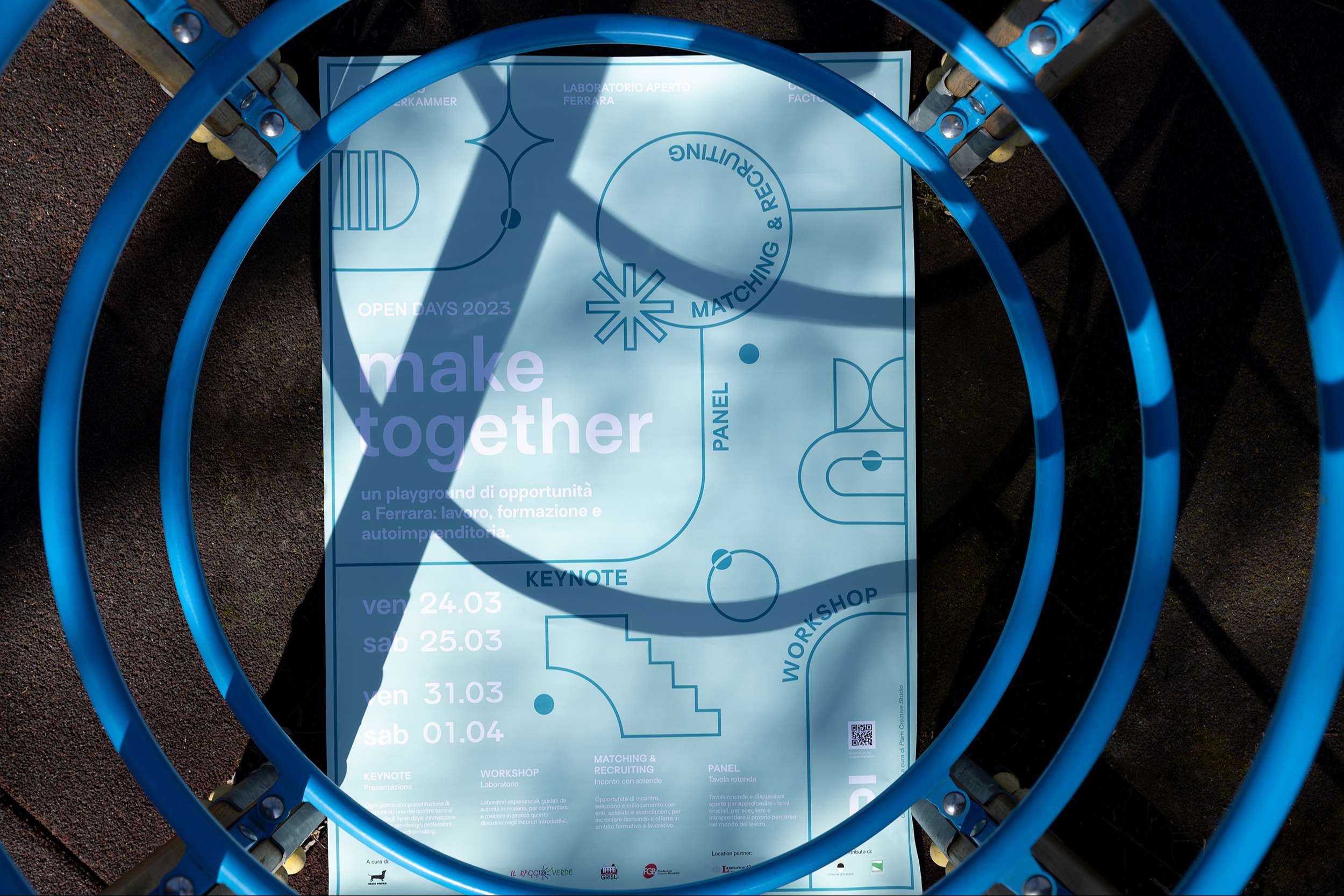
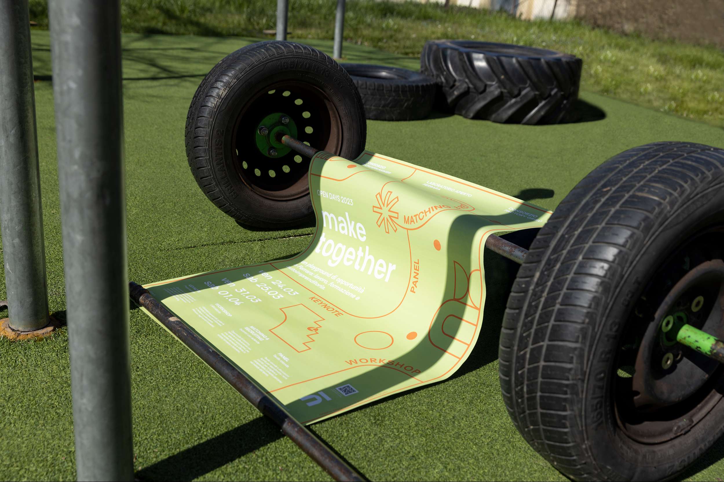
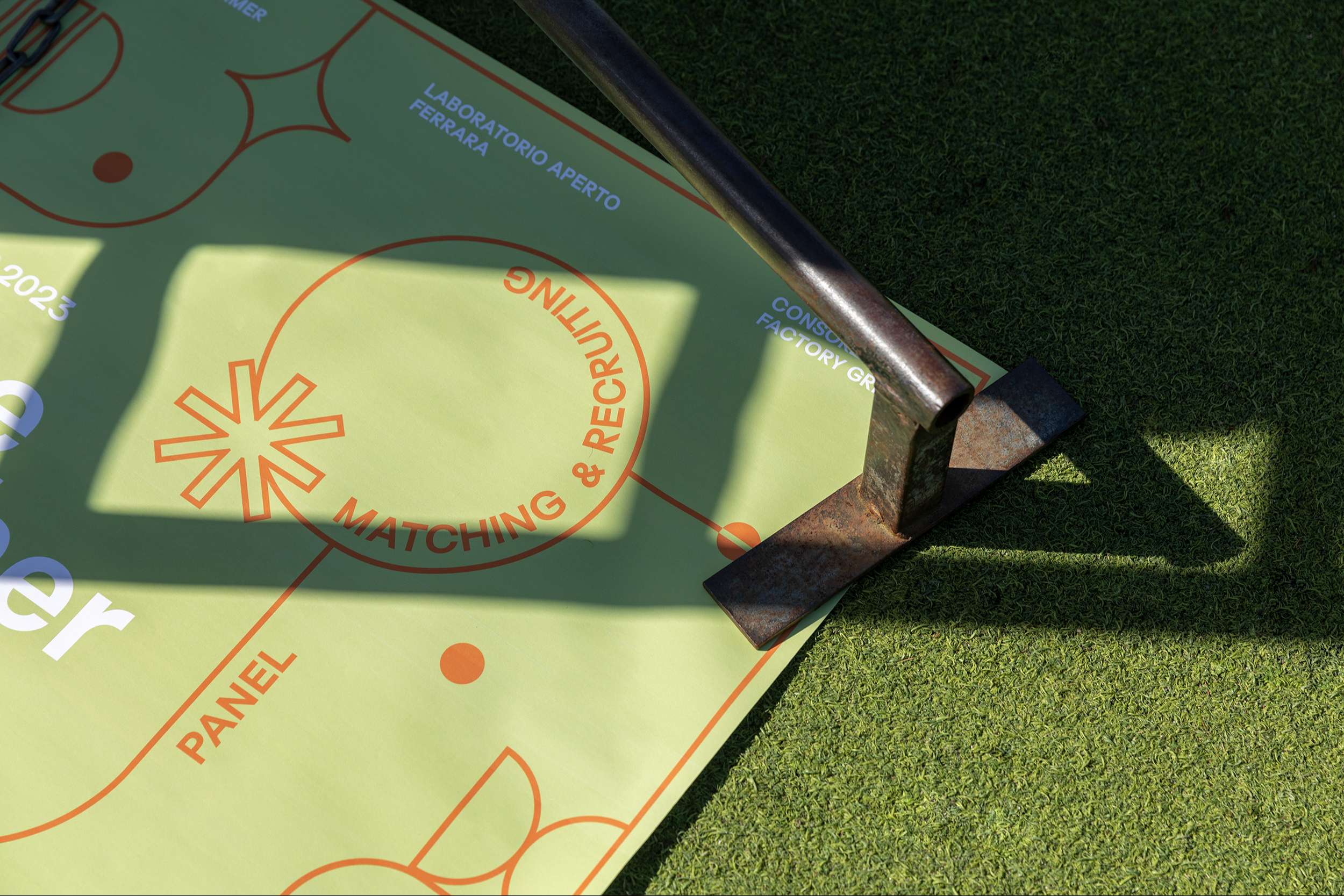
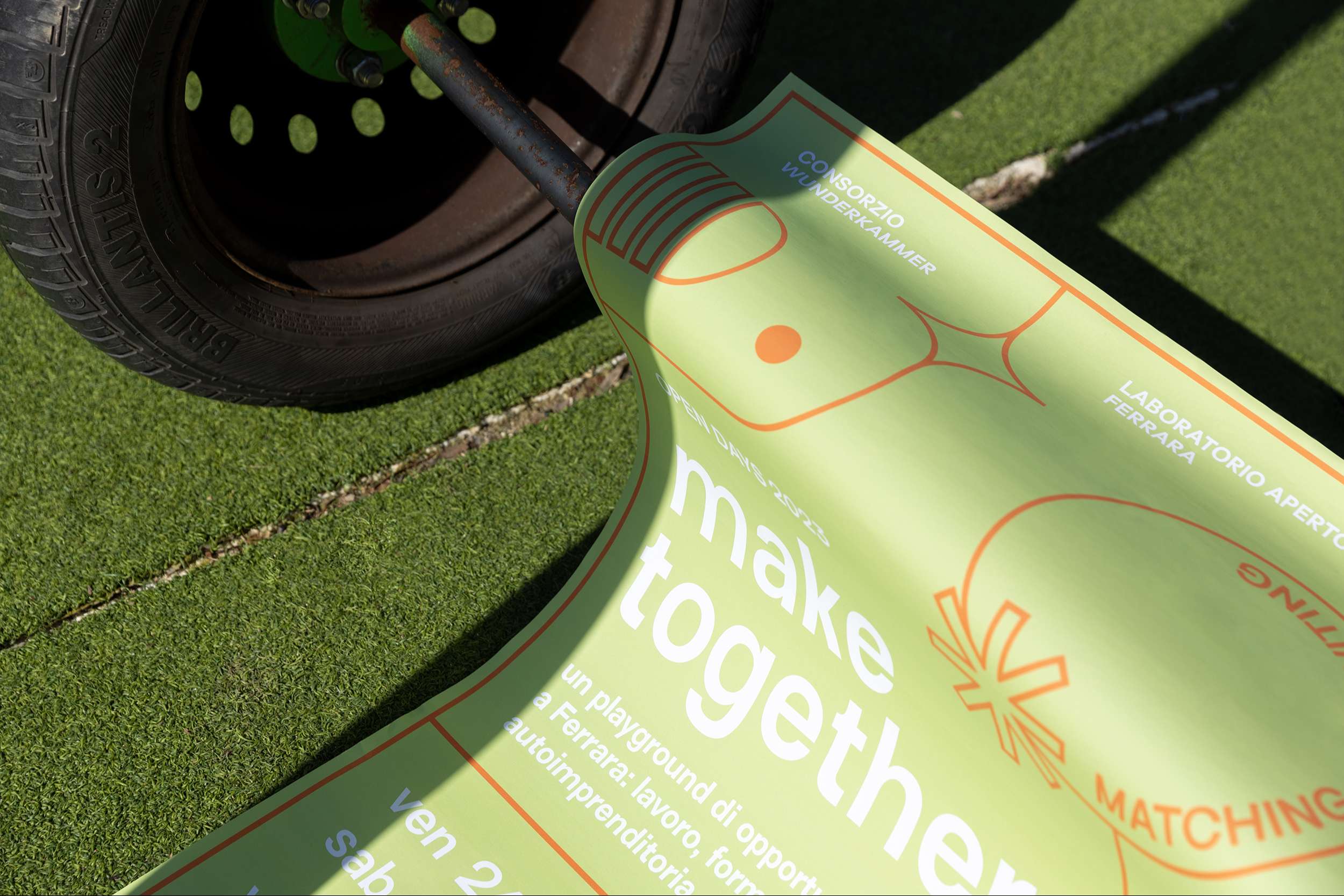
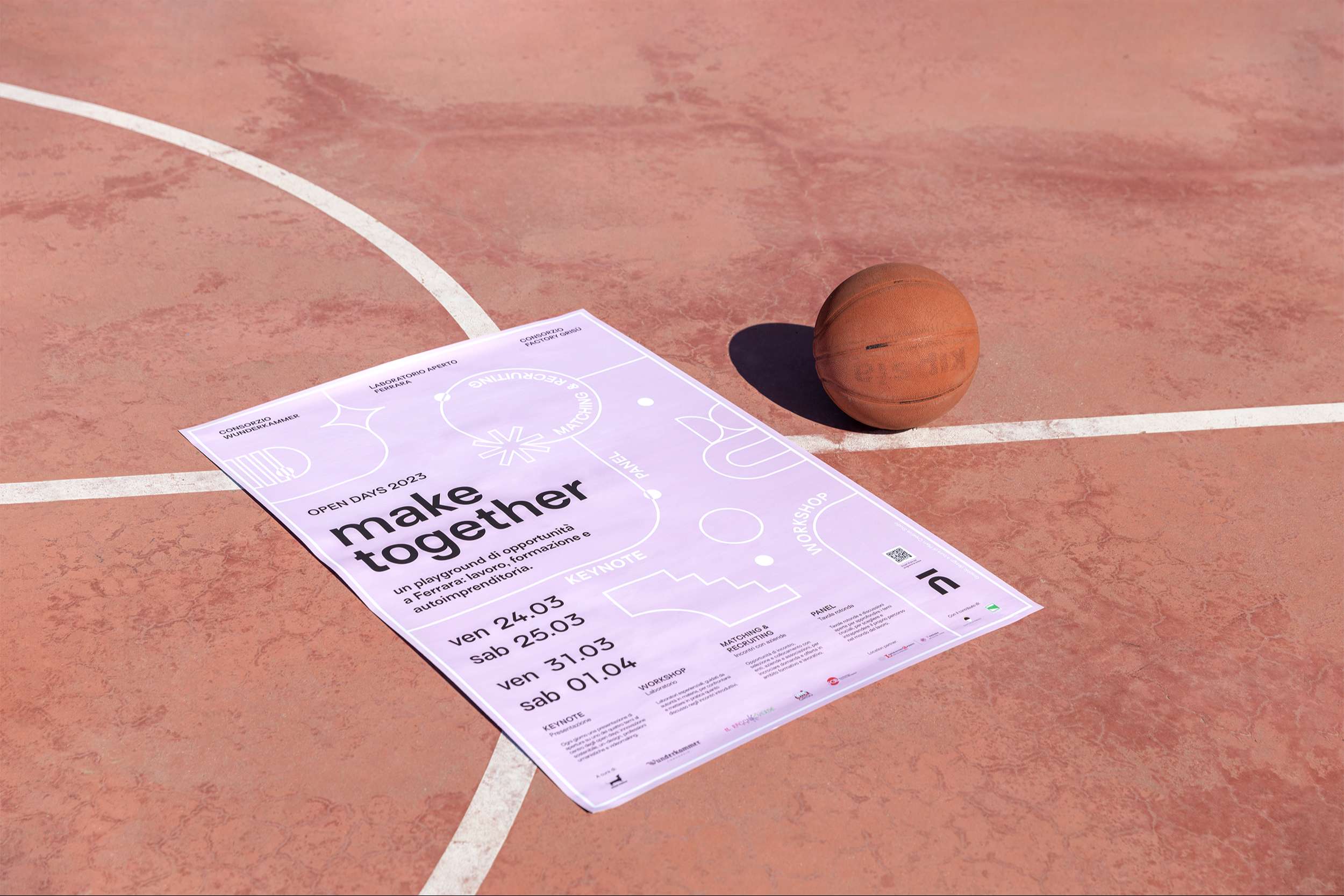
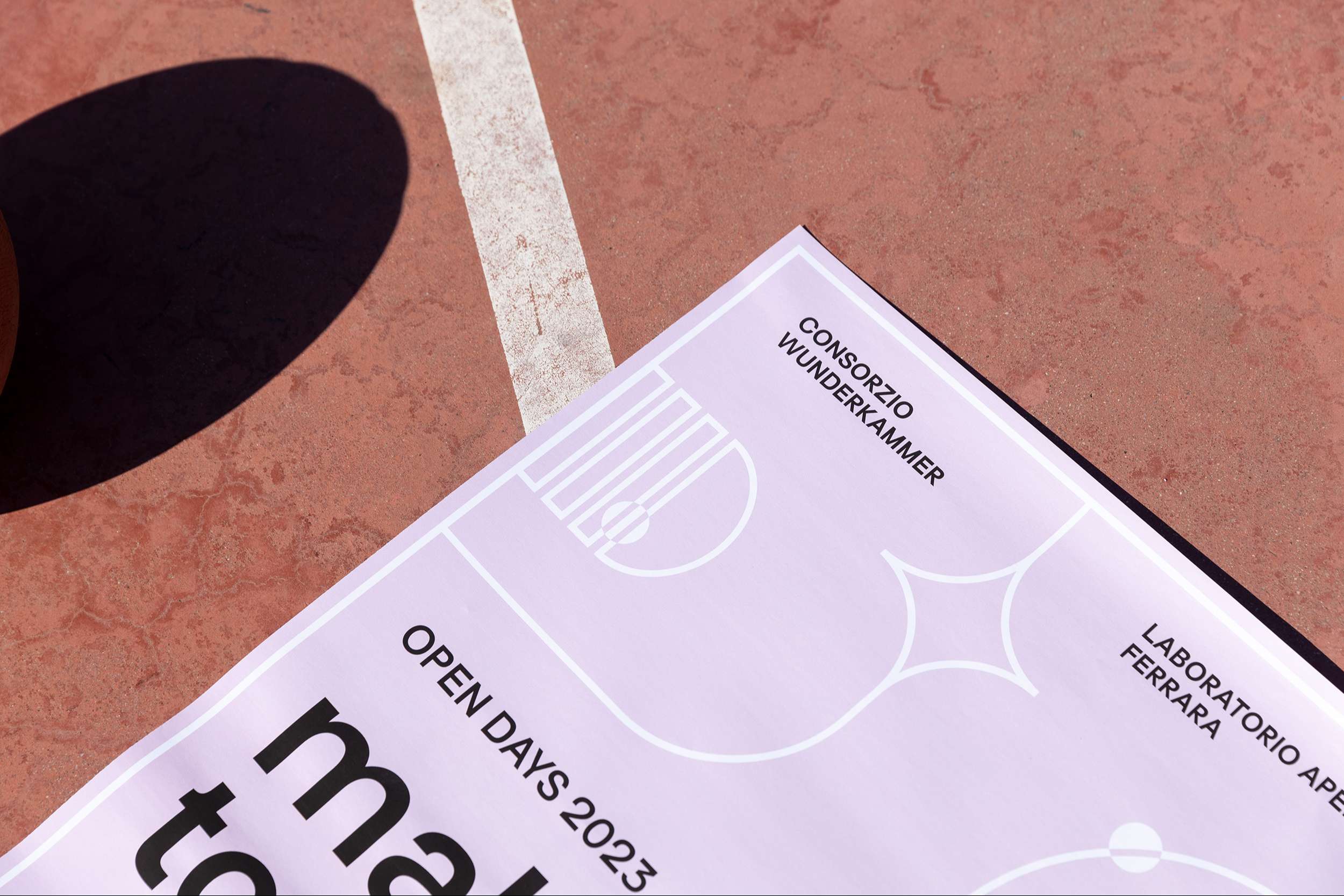
The graphic concept arose from the need to communicate the city playground promoted by the project. A stylized playground, seen from above, was graphically reproduced, inspired by spaces usually dedicated to leisure time (squares, theaters, arcades), creating an abstract field in which the community could interact.
The balls represent the people who are actresses in the unrestricted game. Words run through the field, defining the areas of play.
The four themes addressed by the project were stylized through the creation of symbolic language. The circle represents innovation, the asterisk the un-design, the star the new-media and the hourglass the humanities professions.
The three color combinations reflect the city's three hubs as well as host venues for the events, creating a color code within the program, a facilitated identification of the venue where the activity will take place. In fact, each venue has been chromatically characterized through printed graphic outputs: posters, banners, flyers.
Grazie al linguaggio simbolico e cromatico, è stato possibile realizzare un public program tabellare e sintetico, diffuso tramite flyer, e una comunicazione social diretta e coordinata.
The "Make Together" Logotype
The logotype created for “make together” is the result of a transformation process. The monogram (mt), evolves into a pictogram, the result of the intersection of the two letters.
Straight and curved lines, as in the rest of the graphics, come together in playful and friendly shapes. Posters, flyers, and media communicate with each other by conveying a welcoming feeling. All the information is summarized in the postcards or given in the information brochure and landing page, where dates, appointments, ideas, presentations, and photos are organized in a dynamic and colorful way to make them easy and immediate to browse.